

- General file format
- Getting from daily stock details to a timeseries (not literally)
- The charting part
As part of my efforts at learning R, I stumbled upon the idea of charting Indian stocks listed on NSE. I already had some piece of code to get the stock information - written as part of pricing my portfolio account within GNUCash. GNUCash has the facility to write our own Perl modules to access different financial data.
In the case of National Stock Exchange, the historical market data (Open/Close/H/L/Volume etc.) are available freely on their website at www.nseindia.com. These market figures are called ‘bhav’ (value in Hindi) and the files themselves were called bhavcopy.
NOTE: If you are interested in following long, I have a few sample csv files and a R-Markdown file with the code on github.com
General file format
Each file for a given date is available as a zipped csv file. The zip file contain csv files named like cm23OCT2015bhav.csv
As an example, the contents are like below:
SYMBOL,SERIES,OPEN,HIGH,LOW,CLOSE,LAST,PREVCLOSE,TOTTRDQTY,TOTTRDVAL,TIMESTAMP,TOTALTRADES,ISIN,
20MICRONS,EQ,34.55,38.3,33.95,35.6,35.55,34.55,27313,965326.6,31-MAR-2015,307,INE144J01027,
3IINFOTECH,EQ,5.95,6.05,5.7,5.8,5.8,5.8,2621260,15490167.55,31-MAR-2015,3119,INE748C01020,
3MINDIA,EQ,8001.05,8150,7900.05,7935.3,7925.9,8034.2,178,1421292.4,31-MAR-2015,83,INE470A01017,
8KMILES,EQ,730,744,702,711.55,708.45,722,71042,51481004.25,31-MAR-2015,3552,INE650K01013,
A2ZINFRA,EQ,15.5,15.9,15.2,15.3,15.4,15.25,156555,2424829,31-MAR-2015,602,INE619I01012,
AARTIDRUGS,EQ,658,665,630,649.95,649.9,654.5,41964,27394744.15,31-MAR-2015,2049,INE767A01016,
AARTIIND,EQ,352,364,343.95,350.8,346.9,349.2,116529,41496490.55,31-MAR-2015,3368,INE769A01020,
AARVEEDEN,EQ,40.8,41.95,40.8,41.1,41.05,40.75,721,29945,31-MAR-2015,18,INE273D01019,
Getting from daily stock details to a timeseries (not literally)
To keep things simple, I wrote a small function to load ‘all’ csv files in a given directory and merging the contents into one huge dataframe. The function is shown below:
I keep this and similar utility functions in ~/.Rprofile
While checking the TIMESTAMP column in the frame, it is clear that it was loaded as plain text and needs to be converted to a Date. You can check the class of each column using
sapply(dataframe, class)The charting part
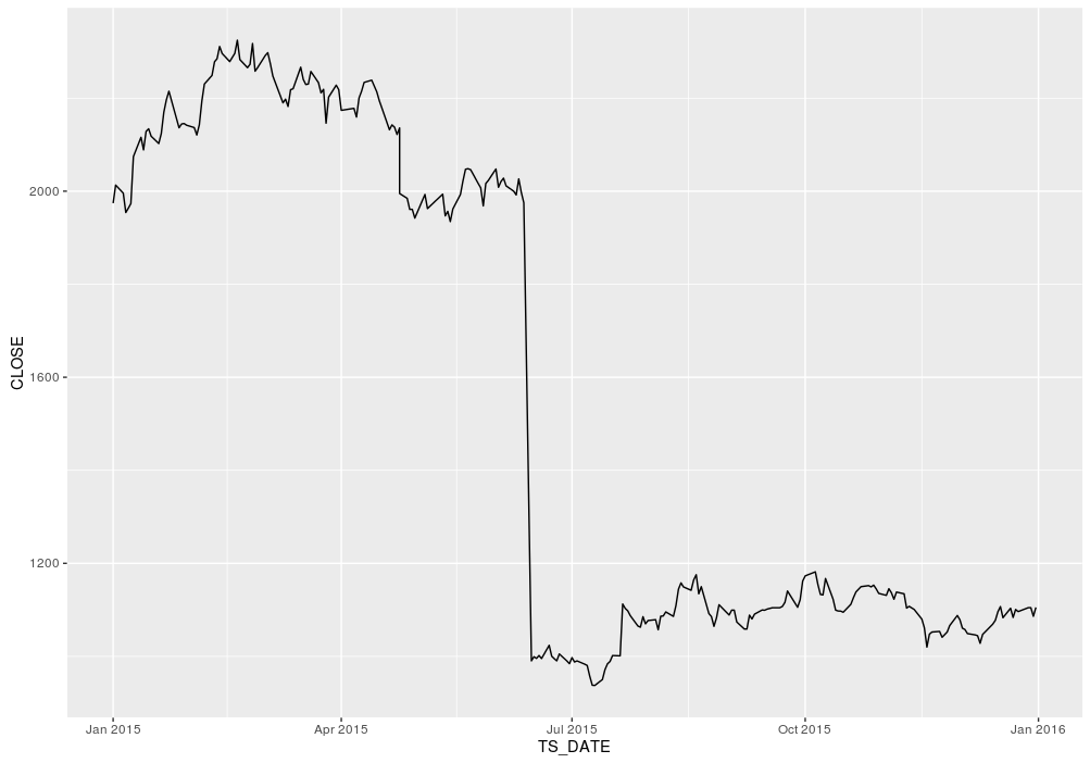
Since this is a huge table with all the stock information, I have to filter out the ones corresponding to a given symbol and the plot it. In my case, I chose to use INFY stock (Infosys Technologies) and entire 2015 data.
Plotting a line chart shows a surprise drop in share price around mid-year. Turns out that was during a 1:1 bonus stock issue. Atleast, it is not due to a bug in my code!
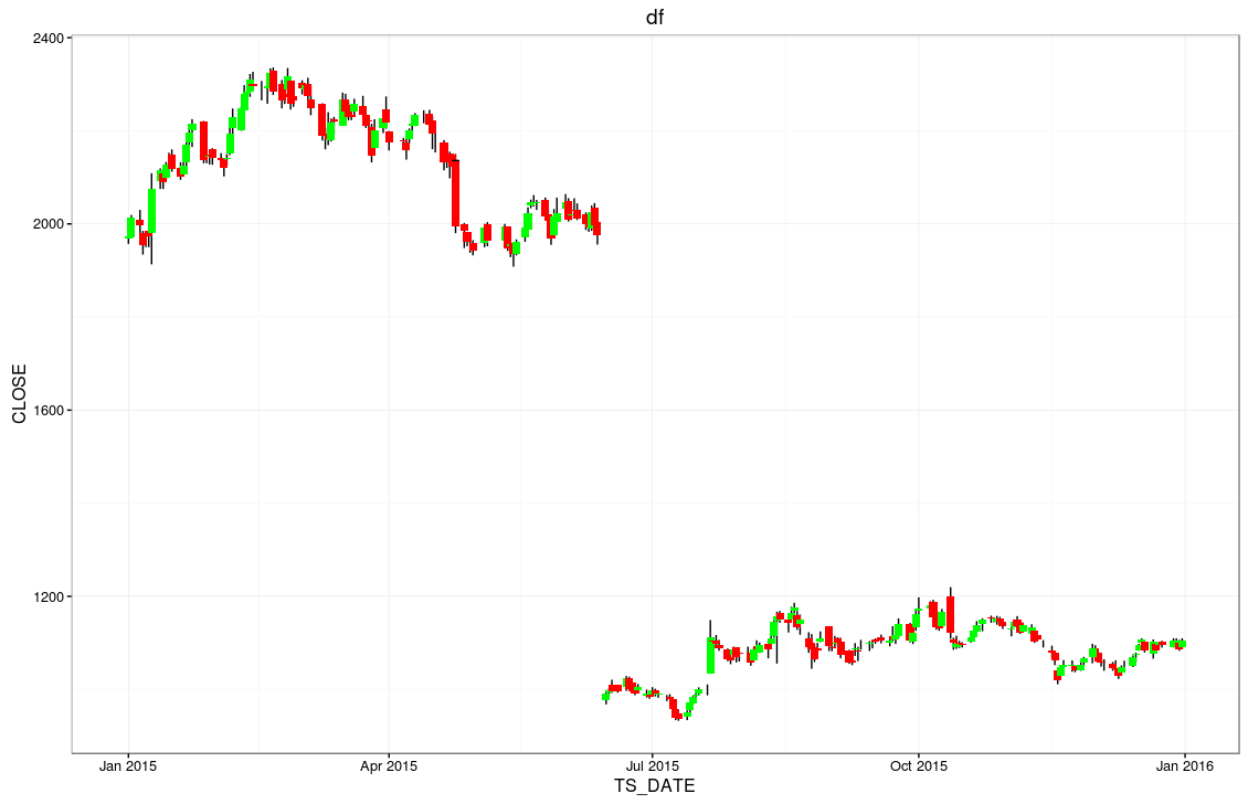
To make things a bit more glamorous, I tried to plot the candle-chart. This turns out to be a bit more harder. We need to know the net-trend (up/down) to decide the color. In addition, we need the decide the rectangle for the candle body and then the length of the wicks. Much of the code is to figure out those numbers.
Let me know what you think. I am sure it is easier to get this view / info by visiting some popular charting sites. But then, I wouldnt be learning R :)
comments powered by Disqus